Nou
Nou
Nou

Founded by developers and built for developers, Nou introduced the world to feature management. Already a favorite within SaaS technology markets, Nou was ready for a brand that matched their ambitions.
Founded by developers and built for developers, Nou introduced the world to feature management. Already a favorite within SaaS technology markets, Nou was ready for a brand that matched their ambitions.
Founded by developers and built for developers, Nou introduced the world to feature management. Already a favorite within SaaS technology markets, Nou was ready for a brand that matched their ambitions.
Case
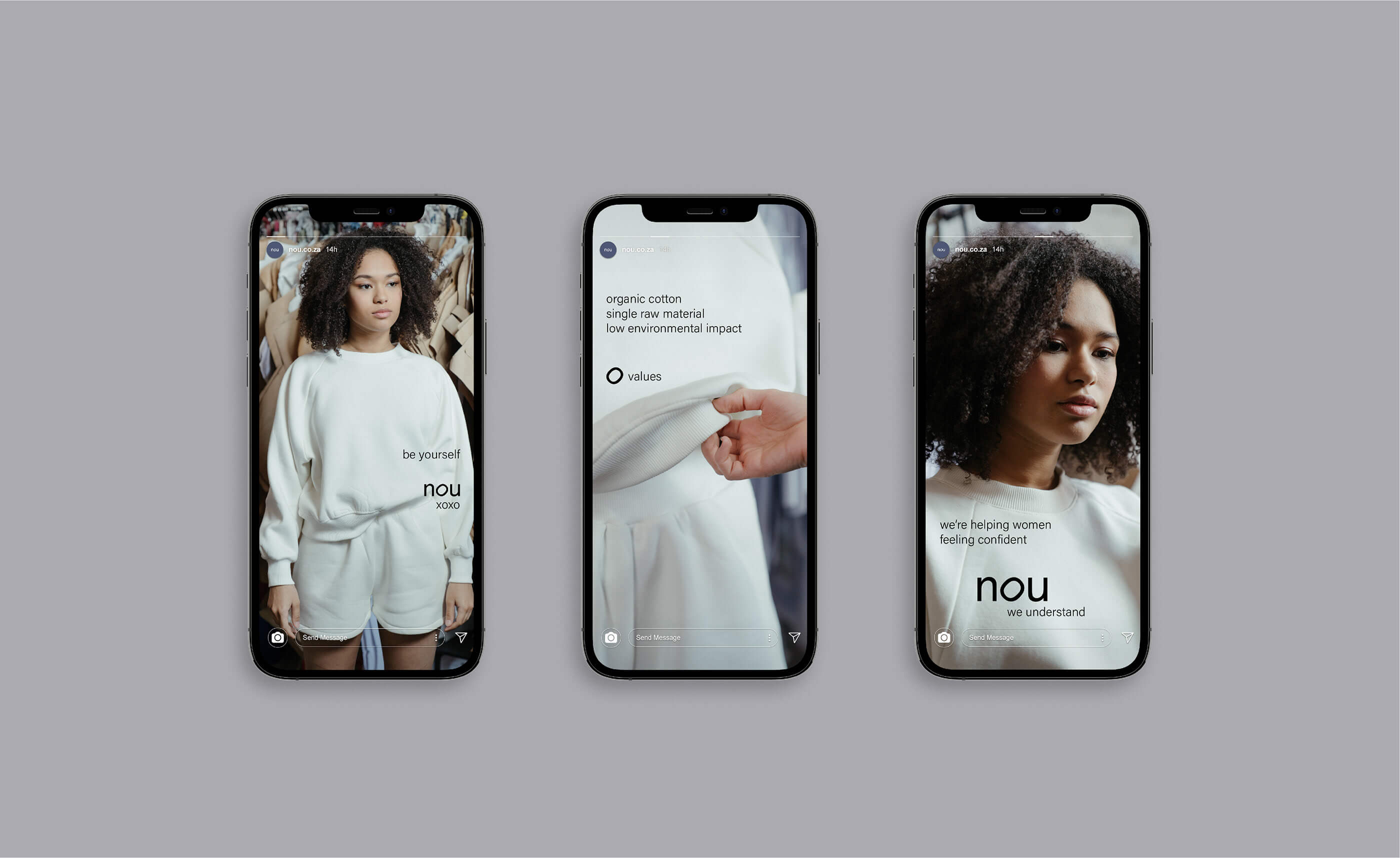
Nou is a young handmade clothing brand from Cape Town, South Africa that produces eco-friendly garments. The apparel aims to add more comfort into the daily life of people, especially during the pandemic. The Nou's clothing design philosophy relies in simplicity, pastel shades, and a lack of patterns - they highly value comfort and relax feeling. The company also claims that there is a possibility to provide comfort clothing taking care of nature, and they do so. Thus, the brand uses organic cotton in their apparel production that is grown using methods and materials that have a low impact on the environment.
Solution
The brand identity's main goal was to convey the company's sustainability positioning and its focus on providing comfort clothing. The overall visual design was created to support the apparel minimalist style and reflect its values. The dark purple/blue color stands as a main design element getting most of the attention: it symbolises calmness, peace, and reliability - what people are the most lack of lately. Small sans serif type puts an emphasis on simplicity, while the "o" letter in the logo symbolises a relaxed feeling and a struggle against perfection.
This artwork originally designed by Kate Zest Studio and appeared on Behance.
Case
Nou is a young handmade clothing brand from Cape Town, South Africa that produces eco-friendly garments. The apparel aims to add more comfort into the daily life of people, especially during the pandemic. The Nou's clothing design philosophy relies in simplicity, pastel shades, and a lack of patterns - they highly value comfort and relax feeling. The company also claims that there is a possibility to provide comfort clothing taking care of nature, and they do so. Thus, the brand uses organic cotton in their apparel production that is grown using methods and materials that have a low impact on the environment.
Solution
The brand identity's main goal was to convey the company's sustainability positioning and its focus on providing comfort clothing. The overall visual design was created to support the apparel minimalist style and reflect its values. The dark purple/blue color stands as a main design element getting most of the attention: it symbolises calmness, peace, and reliability - what people are the most lack of lately. Small sans serif type puts an emphasis on simplicity, while the "o" letter in the logo symbolises a relaxed feeling and a struggle against perfection.
This artwork originally designed by Kate Zest Studio and appeared on Behance.
2021
Kate Zest Studio
https://twitter.com
Packaging Design
2021
Kate Zest Studio
https://twitter.com
Packaging Design
2021
Kate Zest Studio
https://twitter.com
Packaging Design


